
RAVELRY ICONS
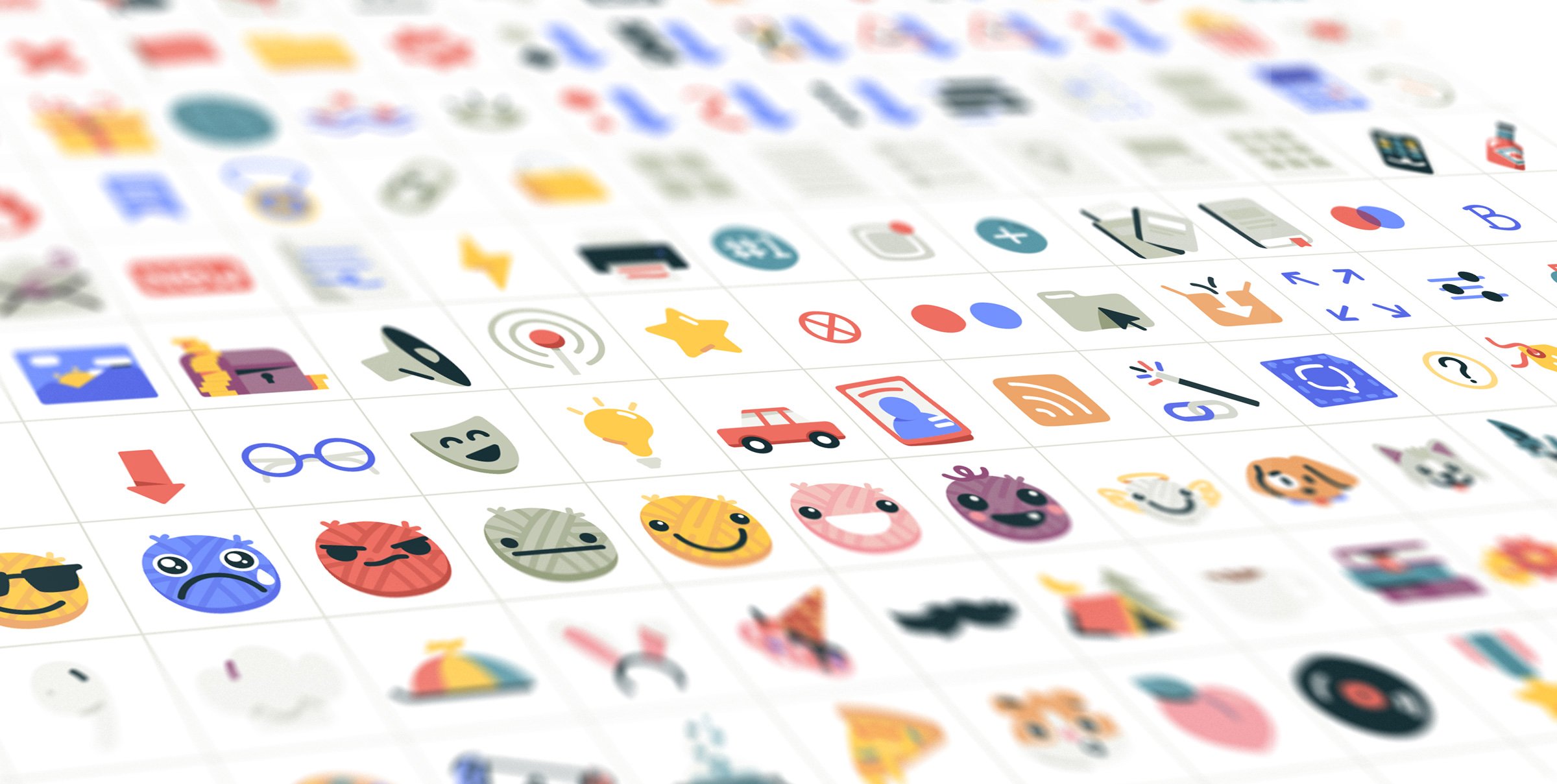
Icon Set
Style development and execution for 200+ icons.
Ravelry is an independently run community website and resource for knitters and crocheters. They average about 1,000,000 active users per month with a user base of almost 10 million. All this achieved by a small team of 6!
These impressive statistics are mentioned to demonstrate how important nailing their recent redesign was.
Ravelry commissioned me to develop an icon style that was scalable and unique to the site’s character and execute ~200 icons.
CLIENT
Ravlery
ART DIRECTION
Livia Nelson
Key words to describe Ravelry are handmade, heartfelt, caring, imperfect, mighty, and expressive.
We began the process with a deep dive on where the icons would predominantly live. What color backgrounds? What sizes? Are they accompanied with text? Hover/alt titles?
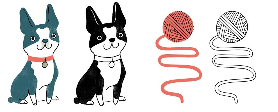
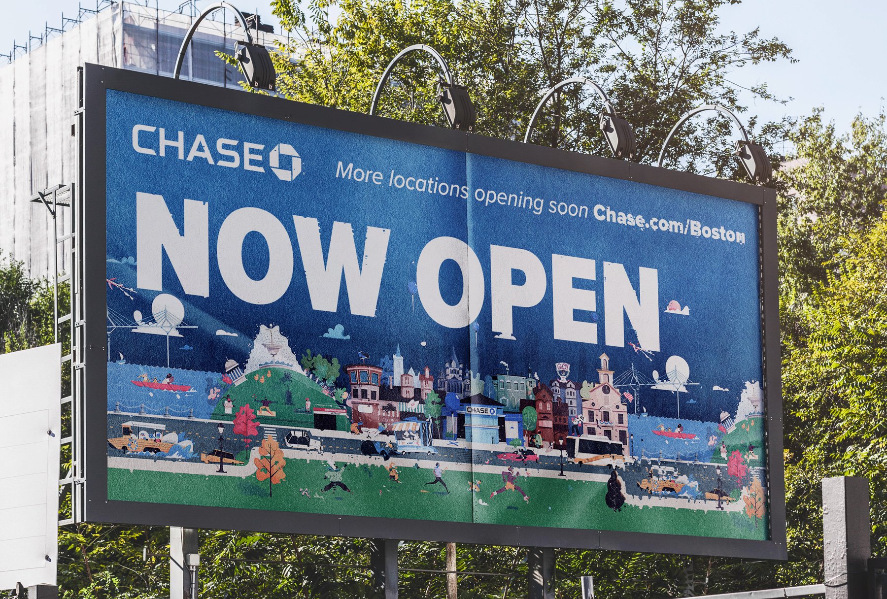
Illustration by Ravelry / Sara Bicknell
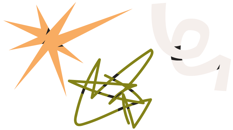
Next, I took some inspiration from their new illustrations to create style tests to discover some visual motifs, color palettes, and shape language.
We ended up with 4 directions that all felt like the fit in the world we’re aiming for with some minor stylistic differences.
Both the client and myself aligned immediately on the flat shapes of color with line-work for detail. Next we stress tested it against a few more icons.
Setting up some basic simple rules go a long way.
Now that we trust things are working correctly and feel unified, we established rules so all 200+ icons would feel consistent.